Saturday, 30 April 2011
Brand Identity
Throughout the 3 products i have created, I wished to keep the band image very simple, and have attempted to create a uniformity between them. For example, similar fonts are used in the logo to that of the information booklet and album poster. This is continued with the contrast of light and dark, seen in the white font against black background, streetlights in the dark and the black and white effect placed on the music video. Another way to keep a simple image was to create an anonymous band, not including an image of them in the booklet or promotional material, and not filming their faces in the video. This is to make the band almost seem humble, and not interested about fame or success, and only create music for the sake of good music. Bands that hold these views tend to be aimed at those who aim to be rebellious and reject pop sensibilities, such as the traditional Stars that Dyer notes in his theory. These individuals are usually aged in their late-teens/early-twenties, the central demographic for my target audience.
Sunday, 24 April 2011
AAOL poster

This is the poster I have created for my AAOL EP. This has take heavy influence from the Weekend in the City poster, in placing my writers, and setting the original album cover on a black cover. Although this is designed for a magazine advert, I would design posters and billboard adverts in a similar fashion, to make the overall advertising campain more memorable, as the image would be seen in various places.
Monday, 18 April 2011
Poster Planning
From what I have seen in other posters, what seems to come across most frequently is that the cover art of the album, or at least a very similar image (usually found ether in the inside cover or book, or indeed on other promotional material such as the music video or band website.) For this I will also include the album cover as the central image, on a simple black background, so as to fit the night setting of the image. It will also include the band logo I have created, as well as the product information written underneath in the same, or similar font. Information generally included in album posters include :
- Name of band
- Name of album
- "Brand new album from..."/"Debut album from..."
- Any past or upcoming singles (release details?)
- Release date/"Out now"
- Release details - Format (Download, CD, 7"),
- Band website/Myspace/Facebook/Twitter
- Any additional information.
Saturday, 16 April 2011
Poster inspiration


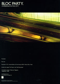 I have planned to create a simplistic poster for this album, in keeping with the simple CD art. Two examples of such are Bloc Party's A Weekend In The City and The Horrors' Primary Colours. I could only find an example of A Weekend In The City, but I did search for other recent examples of popular albums with posters of this kind. I will take inspiration from these.
Wednesday, 13 April 2011
Album posters


Album posters are usually found in a variety of places, most frequently in magazines (most music magazine such as NME, Kerrang, Smash Hits, Uncut, Q and Mixmag, depending on the genre of the music) bus stops, and general high traffic public areas, amongst others. They are also found on billboards for example, however, these are generally altered to fit their landscape shape, as the majority of posters are profile. Here are a few recent examples (please see above)
Subscribe to:
Posts (Atom)