How well does your main product combine with ancillary texts?
Monday, 9 May 2011
Evaluation 3
How did you use new media technologies in the construction and research, planning and evaluation stages?


Whilst researching music videos and the music marketing industry, I used the school's Apple Macs, as well as my own personal laptop (running Windows Vista.) The majority of research was conducted using the internet, such as viewing past examples of music videos through YouTube, or other video streaming sites, since YouTube is blocked on school computers. Had this been a professional video, YouTube would have definetely been used to upload the video to a much Wider audience. My animatic was shot using a Canon Legria FS200, and edited using Apple's iMovie software. Discovering my band first took place through social networking sites such as Facebook and MySpace, but I could not find an apporopriate song. This led me to NME Breakthrough, a website set up by the music magazine NME to create a platform for unsigned bands to find an audience. This lead me to An Army Of Lights, who i contacted through Facebook for permittion to use their song and band name. Whilst they had agreed and offered to send me their song for free, I had already bought their EP from iTunes for personal listening.
When it comes to the actual filming of the video, I used the same Canon Legria FS200 Camcorder I used for taking the images of the animatic, and was used to shoot the final evaluation videos. This camera is Standard definition, which provides a low-fi feel of the overall video, adding realism to the possibility of a debut music video for a band, as well as the convention of indie-rock bands prefering the low-fi approach in production aspects of their videos and music. Throughout filming I used a tripod supplied by the school An issue with this type of mount, compared to a Steadycam for example, is that shots in which the camera is needed to track or follow is very difficult to film without the shot becoming shakey. Shots that were particularly bad for this needed to be edited through iMovie to make the image stable again. Other than the actual instruments used to mime the playing, there were no other media technologies used in the filming process.
Editing took place on the schools Apple Mac computers, again taking advantage of the iMovie software. I used the Black and White and the Heat Wave effects to differ between band clips and the teenagers, with no effects placed on the singing, connoting the lyrics are relevent for both groups, and that they apply to both. iMovie was particularly helpful, especially in the futher editing of clips that were ether too bright or two dark, so that the details were as clear as possible, without losing the effect.
My cover images were shot using a DSLR camera, experimenting with various effects. The band logo was created through experiments with the fonts given on the the version of Microsoft Powerpoint loaded onto the school's Macs. Unfortunatly nether I, nor the school, own a copy of photoshop, or any similar software, so I used Paint on my Windows laptop to insert the logo into my back cover image. This continued to the low-buget feel I continued throughout the video, as this is the debut album and single of an indie band. I did have difficulty fitting the logo in, as the logo seemed fake, but I tried blurring this with some of the program's effects at an attempt at easing this. Similarly, i used paint to create my poster, but this was far simpler, as inserting white writing onto a plain black background was much easier, as opposed to inserting a logo against the orange fade in the cover image. Again, there were issues in this also, as changing the size of the album image to fit into my poster forced the font of the logo to alter, making it jagged (as seen below). I believe that if I used a program more suited to changing the size of images, such as Photoshop, this would not have occured. But, as i have no access to this, this was not possible.
Evaluation 1
In what ways does your product use, develop or challenge forms and conventions of real media products?
Saturday, 30 April 2011
Brand Identity
Throughout the 3 products i have created, I wished to keep the band image very simple, and have attempted to create a uniformity between them. For example, similar fonts are used in the logo to that of the information booklet and album poster. This is continued with the contrast of light and dark, seen in the white font against black background, streetlights in the dark and the black and white effect placed on the music video. Another way to keep a simple image was to create an anonymous band, not including an image of them in the booklet or promotional material, and not filming their faces in the video. This is to make the band almost seem humble, and not interested about fame or success, and only create music for the sake of good music. Bands that hold these views tend to be aimed at those who aim to be rebellious and reject pop sensibilities, such as the traditional Stars that Dyer notes in his theory. These individuals are usually aged in their late-teens/early-twenties, the central demographic for my target audience.
Sunday, 24 April 2011
AAOL poster

This is the poster I have created for my AAOL EP. This has take heavy influence from the Weekend in the City poster, in placing my writers, and setting the original album cover on a black cover. Although this is designed for a magazine advert, I would design posters and billboard adverts in a similar fashion, to make the overall advertising campain more memorable, as the image would be seen in various places.
Monday, 18 April 2011
Poster Planning
From what I have seen in other posters, what seems to come across most frequently is that the cover art of the album, or at least a very similar image (usually found ether in the inside cover or book, or indeed on other promotional material such as the music video or band website.) For this I will also include the album cover as the central image, on a simple black background, so as to fit the night setting of the image. It will also include the band logo I have created, as well as the product information written underneath in the same, or similar font. Information generally included in album posters include :
- Name of band
- Name of album
- "Brand new album from..."/"Debut album from..."
- Any past or upcoming singles (release details?)
- Release date/"Out now"
- Release details - Format (Download, CD, 7"),
- Band website/Myspace/Facebook/Twitter
- Any additional information.
Saturday, 16 April 2011
Poster inspiration


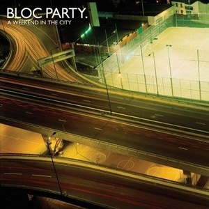
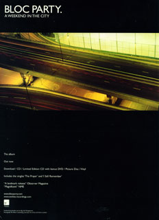 I have planned to create a simplistic poster for this album, in keeping with the simple CD art. Two examples of such are Bloc Party's A Weekend In The City and The Horrors' Primary Colours. I could only find an example of A Weekend In The City, but I did search for other recent examples of popular albums with posters of this kind. I will take inspiration from these.
Wednesday, 13 April 2011
Album posters


Album posters are usually found in a variety of places, most frequently in magazines (most music magazine such as NME, Kerrang, Smash Hits, Uncut, Q and Mixmag, depending on the genre of the music) bus stops, and general high traffic public areas, amongst others. They are also found on billboards for example, however, these are generally altered to fit their landscape shape, as the majority of posters are profile. Here are a few recent examples (please see above)
Sunday, 20 March 2011
AAOL Booklet Art

This is the booklet art for my EP. The is a fold our piece, which is generally rarer than the traditional booklet format. However, this is just another way to connote the opposites I am demonstrating, to suggest the lighter folk and darker, heavier aspects as the bands music. The opposite side of this would include lyrics, as well as production information, set on alternating black and white background. This is fitting with the light dark feel of the front and back covers, and the overall theme of light, as well as the opposites I have explained previously.
Monday, 14 March 2011
Cut front, back and disc cover

Disc cover (with centre of disc at centre of streetlamp)
 Front cover
 Back cover
These are the three cut images for the disc, front and back covers respectively. The disc cover is a section of the front cover focused on the streetlamp. I wanted the very centre of the lamp to be in the centre of the disc, however, this would make the image much less clear than it is already.
I still want to do work on the front cover, to blend logo into the darkness, as I'm not totally happy with it (I have done this at home on paint, whereas school computers have photography software where I can blend the image.)
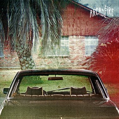
I am still questioning whether or not to include any song titles on the back cover, as many albums do not include them, such as, for example, Arcade Fire's The Suburbs.

 If I do this, I will include song titles in the inner book, that I am still to complete.

Friday, 11 March 2011
Feedback on cover art.
When asking others which image they prefer as a front cover, and which would be more effective at attracting them to buy it, the decision was unanimous for the darker image.
"It just looks a bit more mysterious" Maddie
"It's creepy... It's like its the only light around" Jodie
"It sort of represents the consumer being curious about the album, whilst the back cover is them being enlightened to it" Hannah.
Although I'm not looking for a spooky or mysterious cover, this image was overall more popular, and could (theoretically) have an effect on sales, and attract new customers.
Thursday, 10 March 2011
On futher contemplation...
In fact, whilst also using the example of Arcade Fire solely having their band's title on the back cover, maybe I could do this also with mine, and include an album cover with no band or album title, much in a similar fashion to The Horrors' Primary Colours.

This would still create the same mystery that I thought the dimly lit other image may create, whilst having a more crisp, sharp and professional feel. Having a darker back cover may connote the albums end, or an alternating side, similar to the band's lighter folky and heavier rock style.

This would still create the same mystery that I thought the dimly lit other image may create, whilst having a more crisp, sharp and professional feel. Having a darker back cover may connote the albums end, or an alternating side, similar to the band's lighter folky and heavier rock style.
Intergrated logo
 This is the logo integrated into the image I have chosen as my cover. Although originally drawn to it as a back cover, this image is both more fitting for the logo, but also more intriguing to buyers, and is slightly more blury than the others, very similar to Arcade Fire's The Suburbs and Noah And The Whale's First Day Of Spring.
Cover Art Photography


These are my chosen photography pieces for my album cover. They all capture the beauty of the rural, as with the folky side of the band, whilst showing similarities to the work of Rut Blees Luxemburg. The images also include light as its focus, in keeping with the band and tracks title "An Army Of Lights." So far I'm not decided which will take each position, and I am yet to work the logo into them.
Monday, 7 March 2011

Thursday, 3 March 2011
Band logos
Here are a collection of particularly interesting and innovative band logos.


For An Army Of Lights, I feel a simple logo would be best suited. I am thinking of incorporating the use of different
size fonts as seen in the Noah And The Whale, The Killers, Coheed and Cambria and We Are Scientists, as well as
a simple font that is yet to be chosen. My plan is to experiment over the next few days and post the results.
Tuesday, 1 March 2011
A Perfect Example
In response to my ideas, I remembered this cover... 
I like the strong lighting, so as the band member's faces are barely visible. It includes the grainy, blurry and retro feel
that is seen in Arcade Fire, The Horrors and Vampire Weekend covers. Unfortunately it isn't in an urban landscape,
but the nature aspect fits with the band's folk style.
Wednesday, 16 February 2011
Vampire Weekend, Arcade Fire and my adventures on Google Images
Whilst looking for inspiration for a digi-pak cover, a friend drew me towards the beauty of curtain lighting, as a particularly literal approach to the title An Army Of Lights. I searched DIY sites, and google images for inspiration, and came across these...

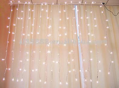
Unfortunately these could not be used, as they are not my own work, but they did remind me of covers of recent indie and folk albums.


(Note: although The Horrors are not particularly folk-y, I did see their cover impressive)
I do like the blurry, retro style of these images, and I would like to incorporate this style in my Digi-pak, if I were to combine this with ether images of curtain lighting, or a city/suburb scene in the style of Rut Blees Luxemburg.
Tuesday, 15 February 2011
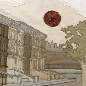
Bloc Party, A Weekend In The City, and Rut Blees Luxemburg.


 To this day, the artwork for Bloc Party's A Weekend in the City, and the singles released for it, remain to be a person favorite of album cover art. These were taken by German Photographer Rut Blees Luxemburg, who typically depicts the beauty of urban scenes and landscapes at night. She also contributed her piece "Towering Inferno" for The Street's debut album Original Pirate Material.
I am personally a big fan of this style of photography, and due to it's association with British music scene, as well as the connection between the often time-delayed artificial lighting and the aptly named title 'An Army Of Lights,' this style may be appropriate.
Sunday, 13 February 2011
Initial inspiration for the digi-pack
Here is a collection of album covers of a similar musical style to An Army Of Lights. This ranges from folk and folk-rock to britpop and post-punk.


 \
\


\
Subscribe to:
Comments (Atom)