Saturday, 16 April 2011

Poster inspiration


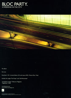
I have planned to create a simplistic poster for this album, in keeping with the simple CD art. Two examples of such are Bloc Party's A Weekend In The City and The Horrors' Primary Colours. I could only find an example of A Weekend In The City, but I did search for other recent examples of popular albums with posters of this kind. I will take inspiration from these.

Wednesday, 13 April 2011

Album posters


Album posters are usually found in a variety of places, most frequently in magazines (most music magazine such as NME, Kerrang, Smash Hits, Uncut, Q and Mixmag, depending on the genre of the music) bus stops, and general high traffic public areas, amongst others. They are also found on billboards for example, however, these are generally altered to fit their landscape shape, as the majority of posters are profile. Here are a few recent examples (please see above)


Sunday, 20 March 2011

AAOL Booklet Art


This is the booklet art for my EP. The is a fold our piece, which is generally rarer than the traditional booklet format. However, this is just another way to connote the opposites I am demonstrating, to suggest the lighter folk and darker, heavier aspects as the bands music. The opposite side of this would include lyrics, as well as production information, set on alternating black and white background. This is fitting with the light dark feel of the front and back covers, and the overall theme of light, as well as the opposites I have explained previously.

Monday, 14 March 2011

Cut front, back and disc cover


Disc cover (with centre of disc at centre of streetlamp)
Front cover
Back cover

These are the three cut images for the disc, front and back covers respectively. The disc cover is a section of the front cover focused on the streetlamp. I wanted the very centre of the lamp to be in the centre of the disc, however, this would make the image much less clear than it is already.
I still want to do work on the front cover, to blend logo into the darkness, as I'm not totally happy with it (I have done this at home on paint, whereas school computers have photography software where I can blend the image.)
I am still questioning whether or not to include any song titles on the back cover, as many albums do not include them, such as, for example, Arcade Fire's The Suburbs.
If I do this, I will include song titles in the inner book, that I am still to complete.

Friday, 11 March 2011

Feedback on cover art.

When asking others which image they prefer as a front cover, and which would be more effective at attracting them to buy it, the decision was unanimous for the darker image.

"It just looks a bit more mysterious" Maddie

"It's creepy... It's like its the only light around" Jodie

"It sort of represents the consumer being curious about the album, whilst the back cover is them being enlightened to it" Hannah.

Although I'm not looking for a spooky or mysterious cover, this image was overall more popular, and could (theoretically) have an effect on sales, and attract new customers.

Thursday, 10 March 2011

On futher contemplation...

In fact, whilst also using the example of Arcade Fire solely having their band's title on the back cover, maybe I could do this also with mine, and include an album cover with no band or album title, much in a similar fashion to The Horrors' Primary Colours.


This would still create the same mystery that I thought the dimly lit other image may create, whilst having a more crisp, sharp and professional feel. Having a darker back cover may connote the albums end, or an alternating side, similar to the band's lighter folky and heavier rock style.

Intergrated logo

This is the logo integrated into the image I have chosen as my cover. Although originally drawn to it as a back cover, this image is both more fitting for the logo, but also more intriguing to buyers, and is slightly more blury than the others, very similar to Arcade Fire's The Suburbs and Noah And The Whale's First Day Of Spring.